DTSA 5301 - COVID Data
library(tidyverse)
library(ggplot2)
library(lubridate)
Analyzing COVID Data from CSSEGIS
John Hopkins University Center for Systems Science and Engineering (JHU CSSE) compiles and hosts global and US data on the COVID-19 pandemic. The data is split into cases and deaths. Through work done in class, the data has been tidied and joined to form aggregate tables for the global and US data.
The original load, analysis, models and graphs are below. For additional analysis, I decided to focus on answering the question: Which counties in Colorado fared the ‘worst’ during COVID?
DSTA In Class Analysis
Load Data
global_cases <- read_csv("https://raw.githubusercontent.com/CSSEGISandData/COVID-19/master/csse_covid_19_data/csse_covid_19_time_series/time_series_covid19_confirmed_global.csv")
spec(global_cases)
global_deaths <- read_csv("https://raw.githubusercontent.com/CSSEGISandData/COVID-19/master/csse_covid_19_data/csse_covid_19_time_series/time_series_covid19_deaths_global.csv")
US_cases <- read_csv("https://raw.githubusercontent.com/CSSEGISandData/COVID-19/master/csse_covid_19_data/csse_covid_19_time_series/time_series_covid19_confirmed_US.csv")
US_deaths <- read_csv("https://raw.githubusercontent.com/CSSEGISandData/COVID-19/master/csse_covid_19_data/csse_covid_19_time_series/time_series_covid19_deaths_US.csv")

global_pop <- read_csv("https://raw.githubusercontent.com/CSSEGISandData/COVID-19/master/csse_covid_19_data/UID_ISO_FIPS_LookUp_Table.csv"
)
Tidy Data
global_cases <- global_cases %>% pivot_longer(cols = -c(`Province/State`, `Country/Region`,Lat, Long), names_to="date", values_to = "cases") %>% select(-c(Lat,Long))

global_deaths <- global_deaths %>% pivot_longer(cols = -c(`Province/State`, `Country/Region`,Lat, Long), names_to="date", values_to = "deaths") %>% select(-c(Lat,Long))

US_cases <- US_cases %>% pivot_longer(cols = -c(`Province_State`, `Country_Region`,Lat, Long_,Combined_Key,Admin2,FIPS,code3,iso3,iso2,UID), names_to="date", values_to = "cases") %>% select(-c(Lat,Long_,UID,iso2,iso3,code3,FIPS))

US_deaths <- US_deaths %>% pivot_longer(cols = -c(`Province_State`, `Country_Region`,Lat, Long_,Combined_Key,Admin2,FIPS,code3,iso3,iso2,UID,Population), names_to="date", values_to = "deaths") %>% select(-c(Lat,Long_,UID,iso2,iso3,code3,FIPS))

# full joins
global <- global_cases %>% full_join(global_deaths) %>%
  rename(Country_Region = `Country/Region`, Province_State = `Province/State`) %>%
  mutate(date =mdy(date))

global <- global %>% unite("Combined_key", c(Province_State, Country_Region), sep=", ", na.rm=TRUE, remove=FALSE)

global <- global %>% left_join(global_pop, by =c("Province_State", "Country_Region")) %>% select(-c(UID,FIPS)) %>% select (Province_State, Country_Region, date, cases, deaths, Population, Combined_key)

global_pos <- global %>% filter(cases > 0)

us <- US_cases %>% full_join(US_deaths)
Visuals
us <- us %>% mutate(date = mdy(date))
US_by_state <- us %>% group_by(Province_State, Country_Region, date) %>% summarize(cases = sum(cases), deaths = sum(deaths), Population = sum(Population)) %>% mutate(deaths_per_mill = deaths *1000000 / Population) %>% select(Province_State, Country_Region, date, cases, deaths, deaths_per_mill, Population) %>% ungroup()
US_totals <- us %>% group_by(Country_Region, date) %>% summarize(cases = sum(cases), deaths = sum(deaths), Population = sum(Population)) %>% mutate(deaths_per_mill = deaths *1000000 / Population) %>% select(Country_Region, date, cases, deaths, deaths_per_mill, Population) %>% ungroup()
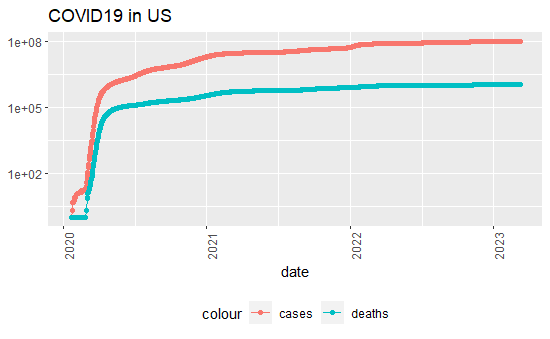
US_totals %>% filter(cases >0) %>%
ggplot(aes(x = date, y = cases)) +
geom_line(aes(color= "cases")) +
geom_point(aes(color = "cases"))+
geom_line(aes(y = deaths, color = "deaths")) +
geom_point(aes(y = deaths, color = "deaths")) +
scale_y_log10() +
theme(legend.position = "bottom", axis.text.x = element_text(angle = 90)) + labs(title = "COVID19 in US", y=NULL)
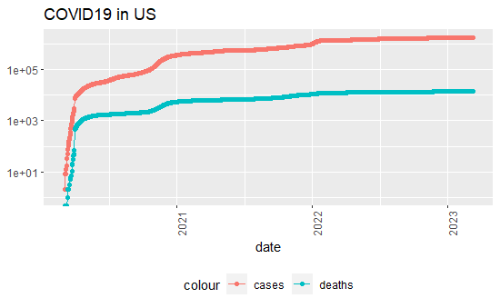
US_by_state %>% filter(cases >0, Province_State == 'Colorado') %>%
ggplot(aes(x = date, y = cases)) +
geom_line(aes(color= "cases")) +
geom_point(aes(color = "cases"))+
geom_line(aes(y = deaths, color = "deaths")) +
geom_point(aes(y = deaths, color = "deaths")) +
scale_y_log10() +
theme(legend.position = "bottom", axis.text.x = element_text(angle = 90)) + labs(title = "COVID19 in US", y=NULL)
Analyzing Data
US_by_state2 <- US_by_state %>%
mutate(new_cases = cases - lag(cases),
new_deaths = deaths - lag(deaths)
)
US_totals2 <- US_totals %>%
mutate(new_cases = cases -lag(cases),
new_deaths = deaths - lag(deaths))
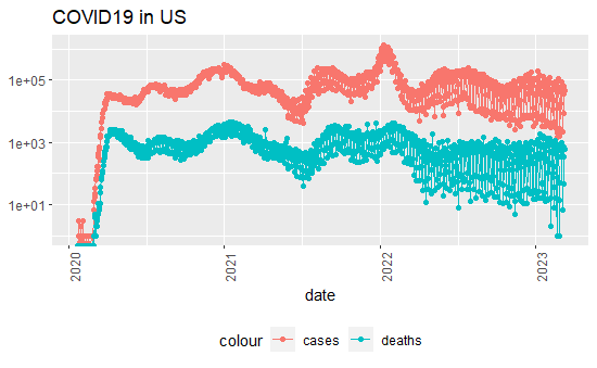
US_totals2 %>% filter(cases >0) %>%
ggplot(aes(x = date, y = new_cases)) +
geom_line(aes(color= "cases")) +
geom_point(aes(color = "cases"))+
geom_line(aes(y = new_deaths, color = "deaths")) +
geom_point(aes(y = new_deaths, color = "deaths")) +
scale_y_log10() +
theme(legend.position = "bottom", axis.text.x = element_text(angle = 90)) + labs(title = "COVID19 in US", y=NULL)
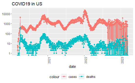
US_by_state2 %>% filter(cases >0, Province_State == 'Colorado') %>%
ggplot(aes(x = date, y = new_cases)) +
geom_line(aes(color= "cases")) +
geom_point(aes(color = "cases"))+
geom_line(aes(y = new_deaths, color = "deaths")) +
geom_point(aes(y = new_deaths, color = "deaths")) +
scale_y_log10() +
theme(legend.position = "bottom", axis.text.x = element_text(angle = 90)) + labs(title = "COVID19 in US", y=NULL)
US_state_totals <- US_by_state2 %>% group_by(Province_State) %>% summarize (deaths = max(deaths), cases = max(cases), population = max(Population), cases_per_thou = 1000* cases/population, deaths_per_thou = 1000*deaths/population) %>% filter(cases >0, population >0)
US_state_totals %>% slice_min(deaths_per_thou, n=10) %>% select(deaths_per_thou, cases_per_thou, everything())
US_state_totals %>% slice_max(deaths_per_thou, n=10) %>% select(deaths_per_thou, cases_per_thou, everything())
Modeling
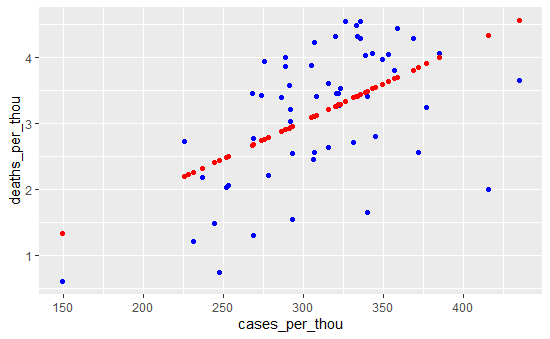
mod <- lm(deaths_per_thou ~ cases_per_thou, data = US_state_totals)

US_state_totals_wp <- US_state_totals %>% mutate(pred = predict(mod))

US_state_totals_wp %>% ggplot() +
  geom_point(aes(x = cases_per_thou, y = deaths_per_thou), color = "blue") +
  geom_point(aes(x = cases_per_thou, y = pred), color = "red")
Additional Analysis
Which county in Colorado fared the ‘worst’ during COVID?
Filter Data
# Filter to CO, arrange by date
co <- us %>% filter(Province_State == 'Colorado')%>% mutate(cases_per_thou = 1000 * cases/Population, deaths_per_thou = 1000*deaths/Population) %>% select(-c('Country_Region', 'Combined_Key')) %>% arrange(mdy(date)) %>% filter(!(Admin2 %in% c('Out of CO', 'Unassigned')))

# Rename Columns
colnames(co)[colnames(co) %in% c("Admin2", "Province_State", "Population")] <- c("county", "state", "population")

# Lag for new cases and deaths
co <- co %>% group_by(county) %>% mutate(new_cases = cases - lag(cases), new_deaths = deaths - lag(deaths), new_cases_per_thou = cases_per_thou - lag(cases_per_thou), new_deaths_per_thou = deaths_per_thou - lag(deaths_per_thou))
co <- co %>% ungroup() %>% group_by(county) %>% mutate(avg_cases = cummean(ifelse(is.na(new_cases), 0, new_cases)), avg_deaths = cummean(ifelse(is.na(new_deaths), 0, new_deaths)), avg_case_p_thou = cummean(ifelse(is.na(new_cases_per_thou), 0, new_cases_per_thou)), avg_death_p_thou = cummean(ifelse(is.na(new_deaths_per_thou), 0, new_deaths_per_thou)))

# Filtering out to last data to get overall sums and averages
co_end <- co %>% filter(date == max(date))

# Pivot for easier data manipulation
co_end2 <- pivot_longer(co_end, c("cases","population","deaths","cases_per_thou","deaths_per_thou","avg_cases","avg_deaths","avg_case_p_thou","avg_death_p_thou","new_cases","new_deaths","new_cases_per_thou","new_deaths_per_thou"), names_to='variable', values_to = 'value')
Plots
Total Cases and Deaths
# Find top 10 counties
co_top_total <- co_end %>% ungroup %>% slice_max(cases, n=10)
co_top_total_counties <- c(co_top_total$county)

co_end2 %>% filter(variable %in% c('cases', 'deaths'), county %in% co_top_total_counties) %>%
  ggplot() +
  geom_col(mapping = aes(x = reorder(county, -value), y= value/1000, fill = variable)) +
  labs(x="County", y="Total (Thousands)", title="Total Cases and Deaths in the Top 10 Counties") +
  scale_fill_discrete(name="Statistic",labels=c("Total Cases", "Total Deaths")) +
  theme(axis.text.x = element_text(angle = 45)) +
  facet_wrap(vars(variable), scales='free')
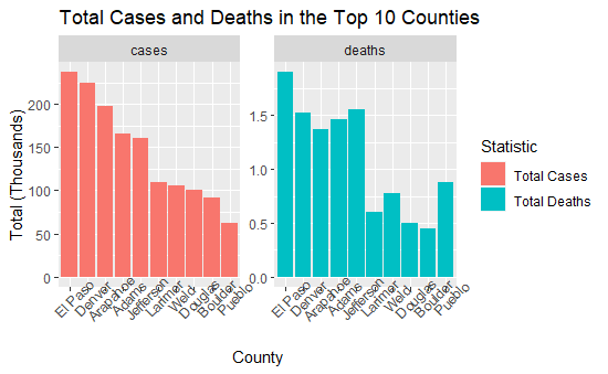
From the above visual, it looks like El Paso, Denver, Arapahoe, Adams, Jefferson, and Larimer counties did not do well during the Pandemic. However; this does not take into account population. El Paso (Colorado Springs), Denver, Arapahoe, Jefferson, and Adams county are the most populated counties in Colorado in that order. Douglas county is slightly larger population wise than Larimer, but appears lower down on the overall case and deaths.
Average Cases and Deaths
# Find top 10 counties
co_top_avg <- co_end %>% ungroup %>% slice_max(avg_cases, n=10)
co_top_avg_counties <- c(co_top_avg$county)

co_end2 %>% filter(variable %in% c('avg_cases', 'avg_deaths'), county %in% co_top_avg_counties) %>%
  ggplot() +
  geom_col(mapping = aes(x = reorder(county, -value), y= value, fill = variable)) +
  labs(x="County", y="Average (per day)", title="Average Cases and Deaths in the Top 10 Counties") +
  scale_fill_discrete(name="Statistic",labels=c("Average Cases", "Average Deaths")) +
  theme(axis.text.x = element_text(angle = 45)) +
  facet_wrap(vars(variable), scales='free')
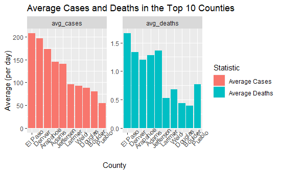
Looking at the average new case and deaths visual, we again see El Paso, Denver, Arapahoe, Adams, Jefferson, and Larimer county, or some of the most populated counties.
Average Cases and Deaths
# Find top 10 counties
co_top_avg_p <- co_end %>% ungroup %>% slice_max(avg_cases, n=10)
co_top_avg_p_counties <- c(co_top_avg_p$county)

co_end2 %>% filter(variable %in% c('avg_case_p_thou', 'avg_death_p_thou'), county %in% co_top_avg_p_counties) %>%
  ggplot() +
  geom_col(mapping = aes(x = reorder(county, -value), y= value, fill = variable)) +
  labs(x="County", y="Total", title="Average Cases and Deaths per Thousand in the Top 10 Counties") +
  scale_fill_discrete(name="Statistic",labels=c("Average Cases per Thousand", "Average Deaths per Thousand")) +
  theme(axis.text.x = element_text(angle = 45)) +
  facet_wrap(vars(variable), scales='free')
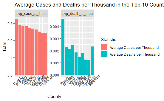
The average cases per thousand, calculated by finding the change in the previous and current cases per thousand over time, begins to show a different story. Denver county is no longer the second highest county when represented in cases per thousand. Pueblo, Jefferson, and Weld counties also have noticeably higher average deaths per thousand that other counties.
Deaths Over Time
# Find top 10 counties
co_top_deaths <- co_end %>% ungroup %>% slice_max(deaths, n=10)
co_top_deaths_counties <- c(co_top_deaths$county)

co %>% filter(county %in% co_top_deaths_counties) %>%
  ggplot() +
  geom_line(mapping = aes(x = date, y = deaths, color = county)) +
  labs(x="Date", y="Total Deaths", title="Total Deaths Over Time in the Top 10 Counties")
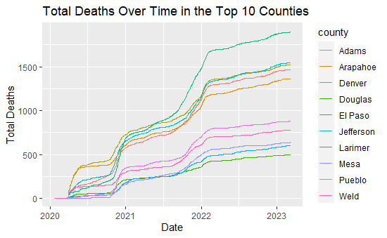
co_top_deaths %>% select(county, population, cases, deaths, cases_per_thou, deaths_per_thou)
| county |
population |
cases |
deaths |
cases_per_thou |
|---|---|---|---|---|
| El Paso | 720403 | 237195 | 1904 | 329.2532 |
| Jefferson | 582881 | 160677 | 1554 | 275.6600 |
| Denver | 727211 | 224919 | 1524 | 309.2899 |
| Adams | 517421 | 166371 | 1466 | 321.5389 |
| Arapahoe | 656590 | 197066 | 1368 | 300.1355 |
| Pueblo | 168424 | 61961 | 880 | 367.8870 |
| Weld | 324492 | 106227 | 780 | 327.3640 |
| Mesa | 154210 | 51841 | 639 | 336.1715 |
| Larimer | 356899 | 109313 | 606 | 306.2855 |
| Douglas | 351154 | 100968 | 498 | 287.5320 |
While potentially difficult to see from the above graph, El Paso is the top green line, followed by Jefferson and Denver (green and yellow), then Adams (red) and Arapahoe (yellow). All counties follow a similar trends overall; however, El Paso had a noticeably steeper increase from mid-2021 to 2022 compared to other counties.
Modeling
co_top_pop <- co_end %>% ungroup %>% slice_max(population, n=20)
co_top_pop_counties <- c(co_top_pop$county)
co_top_pop_only <- co %>% filter(county %in% co_top_pop_counties)

mod_deaths_top <- lm(new_deaths ~ date , data = co_top_pop_only)
mod_deaths <- lm(new_deaths ~ date , data = co)

z <- as.Date(paste(2020, 5, 1, sep = "-"))
z2 <- as.Date(paste(2022, 11, 15, sep = "-"))

co %>% filter(county %in% co_top_pop_counties) %>%
  ggplot() +
  geom_line(mapping = aes(x = date, y = new_deaths, color = county)) +
  labs(x="Date", y="New Deaths", title="New Deaths Over Time in the 20 Most Populated Counties") +
  geom_abline(mapping=aes(intercept=summary(mod_deaths_top)$coefficients[1],slope=summary(mod_deaths_top)$coefficients[2]), col = 'black', linetype = 2, size=1) +
  geom_abline(mapping=aes(intercept=summary(mod_deaths)$coefficients[1],slope=summary(mod_deaths)$coefficients[2]), col = 'grey', linetype = 2, size=1)

## unused code
  # geom_hline(mapping=aes(yintercept = mean(co_end$avg_deaths)), col = 'darkgrey', linetype = 3, size=1)
  # geom_hline(mapping=aes(yintercept = mean(co_top_pop$avg_deaths)), col = 'black', linetype = 3, size=1)
  # geom_text(aes(z,1.3, label='Top 20 Average'), size = 3.5) +
  # geom_text(aes(z,1.8, label='Overall Average'), size = 3.5, color ='grey') +
  # geom_text(aes(z2,2.5, label='Top 20 Model'), size = 3.5) +
  # geom_text(aes(z2,3.5, label='Overall Model'), size = 3.5, color ='grey')
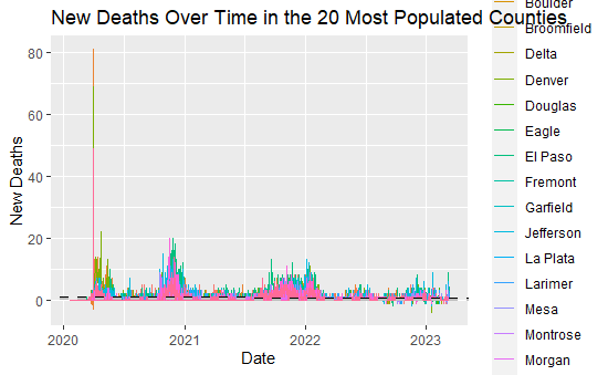
While potentially difficult to distinguish, especially due to the large spike in new deaths in early 2020, the black and grey lines show the linear model (overall and top 20 counties by population). The slope coefficients are printed below:
summary(mod_deaths_top)$coefficients[2]
summary(mod_deaths)$coefficients[2]
[1] -0.0003302051
[1] -0.0001071107
While small, they are both positive, meaning that the liner model is predicting COVID deaths to rise over time. The linear model is likely not a good way to model or predict future trends with this data; however, there have been noticeable spikes at the end of the year, likely centered around holiday travel and COVID spread.
co <- co %>% ungroup() %>% group_by(county) %>% mutate(county_avg_deaths = mean(new_deaths, na.rm=T))
co <- co %>% ungroup() %>% mutate(above_avg_deaths_county = case_when(new_deaths > county_avg_deaths ~ 1, TRUE ~ 0), total_nonzero_death = case_when(new_deaths > 0 ~ 1, TRUE ~ 0))

# Overall and just looking at the 20 most populated counties, Colorado had an average of below 1 deaths per (reported) day!
print(mean(co$new_deaths, na.rm=T))
print(mean(co_top_pop_only$new_deaths, na.rm=T))

co_overall <- co %>% group_by(county) %>% summarize(county_avg_deaths = max(county_avg_deaths), total_above_avg_deaths_county = sum(above_avg_deaths_county), total_total_nonzero_death = sum(total_nonzero_death)) %>% filter(county_avg_deaths > 1) %>% mutate(pct_days_over_county_avg = total_above_avg_deaths_county/total_total_nonzero_death *100)

co_overall
| county |
county_avg_deaths |
total_above_avg_deaths_county |
total_total_nonzero_death |
pct_days_over_county_avg |
|---|---|---|---|---|
| Adams | 1.283713 | 322 | 590 | 54.57627 |
| Arapahoe | 1.197898 | 301 | 521 | 57.77351 |
| Denver | 1.334501 | 313 | 562 | 55.69395 |
| El Paso | 1.667250 | 386 | 622 | 62.05788 |
| Jefferson | 1.360771 | 335 | 588 | 56.97279 |
Overall, Colorado on average and the top 20 most populated counties on average had a below 1 deaths per reported day of data! Because of this, comparing average new deaths per day to these averages becomes difficult since only whole numbers of people can die. Any county with one or more death would be over both averages. Similarly, county overall averages below 1 would also cause any day with over 1 death to be higher than their overall average.
The data is filtered to just the counties with average new deaths higher than 1, which are Adams, Arapahoe, Denver, El Paso, and Jefferson. All have average new death rates lower than 2, but El Paso has the highest with ~1.73 average deaths overall. When comparing the total days above the overall average deaths (i.e. above 1) compared to the days where there was at least one death, El Passo has the higest percent of days where the total deaths were over 2. When potentially comparing against the entire days recorded, because El Paso has the highest days with non-zero COVID deaths, El Paso would still have the highest rate comparing days above their county average.
From the visualizations above and this analysis, I would say that El Paso likely fared the worst during COVID.
Bias
Living in Colorado, I have developed my own biases towards certain counties.
Because there is a large population variation between the large and small counties in Colorado, it’s difficult to compare small counties to larger counties. Even when comparing larger counties, population alone may not tell the full story. Some counties have a more dense population than others, potentially increasing the spread of COVID due to unavoidable contact.
Lastly, with the increasing amount of at home testing options, not all individuals may report a positive COVID test or have their case reported.