Living Wage by State
Purpose
To explore Machine Learning techniques: clustering and classification.
import pandas as pd
import numpy as np
import matplotlib as mpl
import matplotlib.pyplot as plt
import plotly as pl
import plotly.express as px
import scipy as sp
import scipy.stats
import seaborn as sns

plt.style.use("classic")
%matplotlib inline
Loading Data
lw_raw = pd.read_csv("livingwage50states.csv")
state_id = range(1,52)

lw_raw["state_id"] = state_id

lw_state = pd.get_dummies(lw_raw, columns=["2020_election"], prefix=("2020_election"))

lw_state = lw_state.astype("float", errors="ignore")
Matplotlib
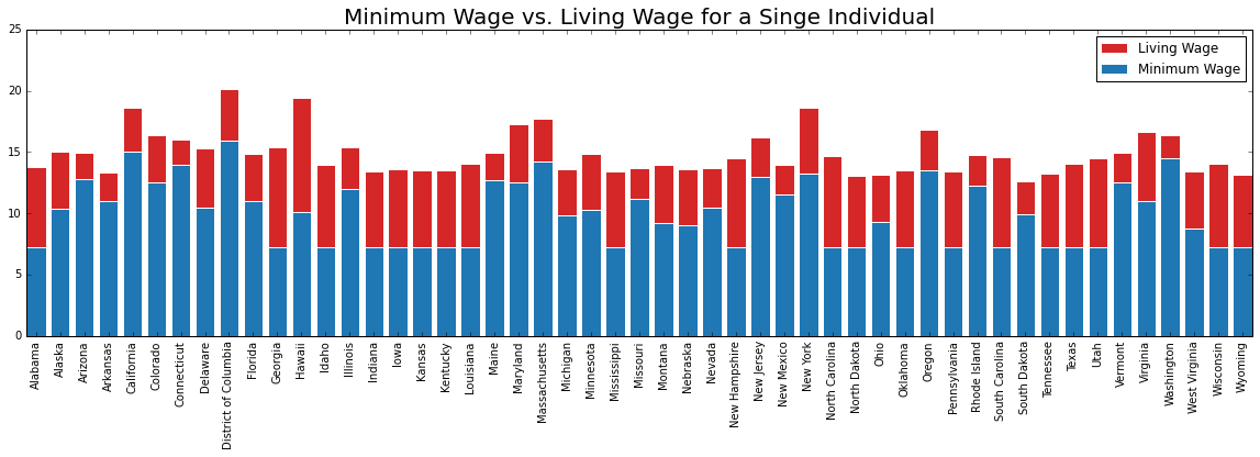
fig, lw_plot1 = plt.subplots(constrained_layout = False, figsize=(20,5))

lw_plot1.bar(lw_state["state_territory"], lw_state["oneadult_nokids"], color ='tab:red', edgecolor ='white', label = "Living Wage")
lw_plot1.bar(lw_state["state_territory"], lw_state["min_wage"], color ='tab:blue', edgecolor ='white', label = "Minimum Wage")
lw_plot1.legend()

lw_plot1.set_title("Minimum Wage vs. Living Wage for a Singe Individual", size = 20)

for tick in lw_plot1.get_xticklabels():
    tick.set_rotation('vertical')

fig.align_labels()

plt.show()
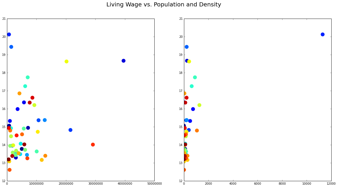
fig, lw_plot2 = plt.subplots(1,2, constrained_layout = False, figsize=(20,10))

lw_plot2[0].scatter(lw_state["population_2020"], lw_state["oneadult_nokids"],  c = lw_state["state_id"], edgecolors='face', s = 150)
lw_plot2[1].scatter(lw_state["population_density"], lw_state["oneadult_nokids"],  c = lw_state["state_id"], edgecolors='face', s = 150)
lw_plot2[0].ticklabel_format(style = 'plain')

lw_plot2[0].set(xlim=(0))
lw_plot2[1].set(xlim=(0))

fig.suptitle("Living Wage vs. Population and Density", fontsize = 20)

plt.show()
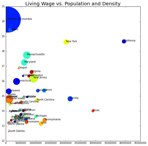
fig, lw_plot3 = plt.subplots(constrained_layout = False, figsize=(10,10))

for axis in [lw_plot3.xaxis, lw_plot3.yaxis]:
    axis.set_major_locator(mpl.ticker.MaxNLocator(integer=True))

lw_plot3.scatter(lw_state["population_2020"], lw_state["oneadult_nokids"], s = lw_state["population_density"], c = lw_state["state_id"], edgecolors='face')
lw_plot3.set(xlim=(0))

for i in range(0,51):
 plt.text(x=lw_state.population_2020[i]+0.5,y=lw_state.oneadult_nokids[i],s=lw_state.state_territory[i], c="black",
          fontdict=dict(color='y',size=10))

lw_plot3.set_title("Living Wage vs. Population and Density", size = 20)

plt.ticklabel_format(style = 'plain')

plt.show()
Classification
Can we classify a Democrat vs. Republican State (2020 Presidential Election Results) from this data set? Only using the population, density, minimum wage, and living wage.
from sklearn.naive_bayes import GaussianNB
from sklearn.naive_bayes import BernoulliNB
from sklearn.naive_bayes import ComplementNB
from sklearn.naive_bayes import MultinomialNB
from sklearn.model_selection import train_test_split
from sklearn.preprocessing import StandardScaler
from sklearn.metrics import accuracy_score
from sklearn.metrics import confusion_matrix
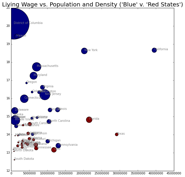
fig, lw_plot4 = plt.subplots( constrained_layout = False, figsize=(10,10))

for axis in [lw_plot4.xaxis, lw_plot4.yaxis]:
    axis.set_major_locator(mpl.ticker.MaxNLocator(integer=True))

lw_plot4.scatter(lw_state["population_2020"], lw_state["oneadult_nokids"], s = lw_state["population_density"], c = lw_state["2020_election_R"], edgecolors='black')
lw_plot4.set(xlim=(0))

for i in range(0,51):
 plt.text(x=lw_state.population_2020[i]+0.5,y=lw_state.oneadult_nokids[i],s=lw_state.state_territory[i], c="grey",
          fontdict=dict(color='y',size=10))

lw_plot4.set_title("Living Wage vs. Population and Density ('Blue' v. 'Red States')", size = 20)

plt.ticklabel_format(style = 'plain')

plt.show()
Naive Bayes Models
# Multinomial NB
x = lw_state.iloc[:,[1,3,4,16]].values
y = lw_state.iloc[:,19].values

x_train, x_test, y_train, y_test = train_test_split(x, y, test_size=0.3, random_state=100)

model = MultinomialNB()
model.fit(x_train,y_train)

y_pred = model.predict(x_test)

print("Accuracy for Predicting Democratic v. Republican States:", (accuracy_score(y_test, y_pred)*100),"%")

cm = confusion_matrix(y_test, y_pred)

print(cm)
    Accuracy for Predicting Democratic v. Republican States: 62.5 %
    [[7 0]
     [6 3]]
# Complement NB
x = lw_state.iloc[:,[1,3,4,16]].values
y = lw_state.iloc[:,19].values

x_train, x_test, y_train, y_test = train_test_split(x, y, test_size=0.3, random_state=100)

model = ComplementNB()
model.fit(x_train,y_train)

y_pred = model.predict(x_test)

print("Accuracy for Predicting Democratic v. Republican States:", (accuracy_score(y_test, y_pred)*100),"%")

cm = confusion_matrix(y_test, y_pred)

print(cm)
    Accuracy for Predicting Democratic v. Republican States: 62.5 %
    [[7 0]
     [6 3]]
# Gaussian NB
x = lw_state.iloc[:,[1,3,4,16]].values
y = lw_state.iloc[:,19].values

x_train, x_test, y_train, y_test = train_test_split(x, y, test_size=0.3, random_state=100)

model = GaussianNB()
model.fit(x_train,y_train)

y_pred = model.predict(x_test)

print("Accuracy for Predicting Democratic v. Republican States:", (accuracy_score(y_test, y_pred)*100),"%")

cm = confusion_matrix(y_test, y_pred)

print(cm)
    Accuracy for Predicting Democratic v. Republican States: 50.0 %
    [[7 0]
     [8 1]]
# Bernoulli NB
## states in order: population, density, living wage, minimum wage
x = lw_state.iloc[:,[1,3,4,16]].values
y = lw_state.iloc[:,19].values

x_train, x_test, y_train, y_test = train_test_split(x, y, test_size=0.3, random_state=100)

model = BernoulliNB()
model.fit(x_train,y_train)

y_pred = model.predict(x_test)

print("Accuracy for Predicting Democratic v. Republican States:", (accuracy_score(y_test, y_pred)*100),"%")

cm = confusion_matrix(y_test, y_pred)

print(cm)
    Accuracy for Predicting Democratic v. Republican States: 43.75 %
    [[7 0]
     [9 0]]
The Bernoulli Naive Bayes (after standardizing the data), was the most accurate model, at 87.5%. Additionally, the model only returned false negatives (e.g. failed to classify a state as Democrat).
Visual Classification
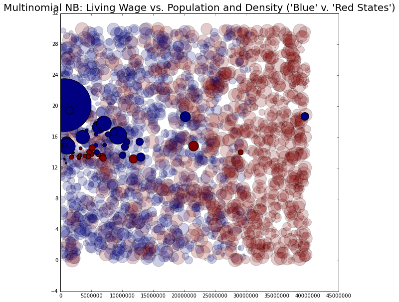
# Multinomial NB
x = lw_state.iloc[:,[1,3,4,16]].values
y = lw_state.iloc[:,19].values

x_train, x_test, y_train, y_test = train_test_split(x, y, test_size=0.3, random_state=100)

model = GaussianNB()
model.fit(x_train,y_train)

rng = np.random.RandomState(0)
Xnew2 = [0, 1, 0, 0] + [40000000, 800, 30, 30] * rng.rand(2000, 4)

ynew2 = model.predict(Xnew2)
fig, lw_plot5= plt.subplots(constrained_layout = False, figsize=(10,10))

for axis in [lw_plot5.xaxis, lw_plot5.yaxis]:
    axis.set_major_locator(mpl.ticker.MaxNLocator(integer=True))

lw_plot5.scatter(Xnew2[:, 0], Xnew2[:, 3], s = Xnew2[:, 1], c = ynew2, alpha = 0.2)
lw_plot5.scatter(lw_state["population_2020"], lw_state["oneadult_nokids"], s = lw_state["population_density"], c = lw_state["2020_election_R"], edgecolors='black')
lw_plot5.set(xlim=(0))

lw_plot5.set_title("Multinomial NB: Living Wage vs. Population and Density ('Blue' v. 'Red States')", size = 20)

plt.ticklabel_format(style = 'plain')

plt.show()
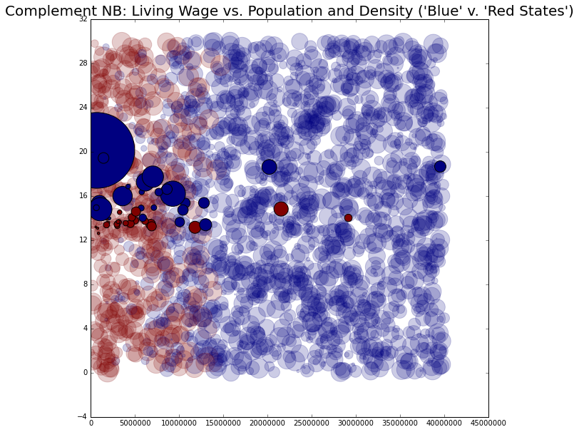
# Complement NB
x = lw_state.iloc[:,[1,3,4,16]].values
y = lw_state.iloc[:,19].values

x_train, x_test, y_train, y_test = train_test_split(x, y, test_size=0.3, random_state=100)

model = ComplementNB()
model.fit(x_train,y_train)

rng = np.random.RandomState(0)
Xnew1 = [0, 1, 0, 0] + [40000000, 800, 30, 30] * rng.rand(2000, 4)

ynew1 = model.predict(Xnew1)
fig, lw_plot6= plt.subplots(constrained_layout = False, figsize=(10,10))

for axis in [lw_plot6.xaxis, lw_plot6.yaxis]:
    axis.set_major_locator(mpl.ticker.MaxNLocator(integer=True))

lw_plot6.scatter(Xnew1[:, 0], Xnew1[:, 3], s = Xnew1[:, 1], c = ynew1, edgecolors='face', alpha = 0.2)
lw_plot6.scatter(lw_state["population_2020"], lw_state["oneadult_nokids"], s = lw_state["population_density"], c = lw_state["2020_election_R"], edgecolors='black')
lw_plot6.set(xlim=(0))

lw_plot6.set_title("Complement NB: Living Wage vs. Population and Density ('Blue' v. 'Red States')", size = 20)

plt.ticklabel_format(style = 'plain')

plt.show()
Clustering
What will the data points cluster into?
from sklearn.cluster import KMeans
from sklearn.cluster import SpectralClustering
x = lw_state.iloc[:,[1,3,4,16]].values

kmeans2 = KMeans(n_clusters=2)
kmeans2.fit(x)

y_means2 = kmeans2.predict(x)
centers = kmeans2.cluster_centers_

fig, lw_plot7= plt.subplots(constrained_layout = False, figsize=(10,10))

for axis in [lw_plot7.xaxis, lw_plot7.yaxis]:
    axis.set_major_locator(mpl.ticker.MaxNLocator(integer=True))

lw_plot7.scatter(lw_state["population_2020"], lw_state["oneadult_nokids"], s = lw_state["population_density"], c = y_means2, edgecolors='face', cmap='Set2')
lw_plot7.set(xlim=(0))

for i in range(0,51):
 plt.text(x=lw_state.population_2020[i]+0.5,y=lw_state.oneadult_nokids[i],s=lw_state.state_territory[i], c="black",
          fontdict=dict(color='y',size=10))

lw_plot7.set_title("KMeans with 2 Clusters", size = 20)

plt.ticklabel_format(style = 'plain')

plt.show()
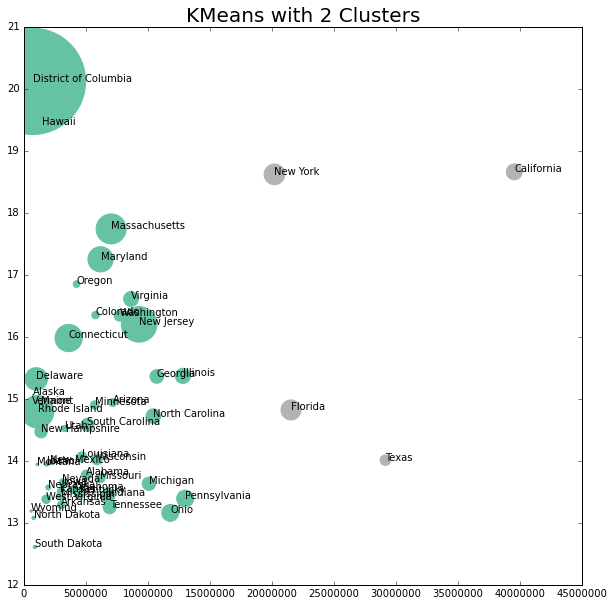
This does not look to be a good cluster grouping.
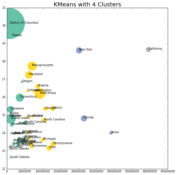
x = lw_state.iloc[:,[1,3,4,16]].values

kmeans4 = KMeans(n_clusters=4)
kmeans4.fit(x)

y_means4 = kmeans4.predict(x)
centers = kmeans4.cluster_centers_

fig, lw_plot8= plt.subplots(constrained_layout = False, figsize=(10,10))

for axis in [lw_plot8.xaxis, lw_plot8.yaxis]:
    axis.set_major_locator(mpl.ticker.MaxNLocator(integer=True))

lw_plot8.scatter(lw_state["population_2020"], lw_state["oneadult_nokids"], s = lw_state["population_density"], c = y_means4, edgecolors='face', cmap='Set2')
lw_plot8.set(xlim=(0))

for i in range(0,51):
 plt.text(x=lw_state.population_2020[i]+0.5,y=lw_state.oneadult_nokids[i],s=lw_state.state_territory[i], c="black",
          fontdict=dict(color='y',size=10))

lw_plot8.set_title("KMeans with 4 Clusters", size = 20)

plt.ticklabel_format(style = 'plain')

plt.show()
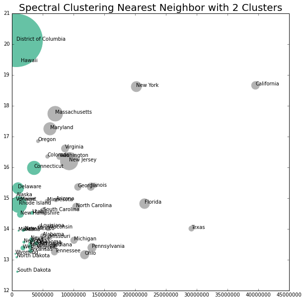
x = lw_state.iloc[:,[1,3,4,16]].values

model = SpectralClustering(n_clusters = 2, affinity = "nearest_neighbors", assign_labels="kmeans")
labels2 = model.fit_predict(x)
fig, lw_plot9= plt.subplots(constrained_layout = False, figsize=(10,10))

for axis in [lw_plot9.xaxis, lw_plot9.yaxis]:
    axis.set_major_locator(mpl.ticker.MaxNLocator(integer=True))

lw_plot9.scatter(lw_state["population_2020"], lw_state["oneadult_nokids"], s = lw_state["population_density"], c = labels2, edgecolors='face', cmap='Set2')
lw_plot9.set(xlim=(0))

for i in range(0,51):
 plt.text(x=lw_state.population_2020[i]+0.5,y=lw_state.oneadult_nokids[i],s=lw_state.state_territory[i], c="black",
          fontdict=dict(color='y',size=10))

lw_plot9.set_title("Spectral Clustering Nearest Neighbor with 2 Clusters", size = 20)

plt.ticklabel_format(style = 'plain')

plt.show()
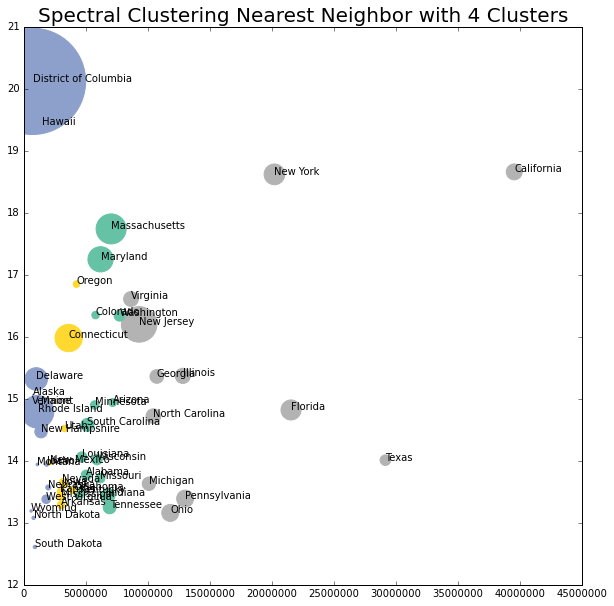
x = lw_state.iloc[:,[1,3,4,16]].values

model = SpectralClustering(n_clusters = 4, affinity = "nearest_neighbors", assign_labels="kmeans")
labels4 = model.fit_predict(x)
fig, lw_plot10= plt.subplots(constrained_layout = False, figsize=(10,10))

for axis in [lw_plot10.xaxis, lw_plot10.yaxis]:
    axis.set_major_locator(mpl.ticker.MaxNLocator(integer=True))

lw_plot10.scatter(lw_state["population_2020"], lw_state["oneadult_nokids"], s = lw_state["population_density"], c = labels4, edgecolors='face', cmap='Set2')
lw_plot10.set(xlim=(0))

for i in range(0,51):
 plt.text(x=lw_state.population_2020[i]+0.5,y=lw_state.oneadult_nokids[i],s=lw_state.state_territory[i], c="black",
          fontdict=dict(color='y',size=10))

lw_plot10.set_title("Spectral Clustering Nearest Neighbor with 4 Clusters", size = 20)

plt.ticklabel_format(style = 'plain')

plt.show()
Final Thoughts
This data likely wasn’t the best to try and classify or cluster, but it was interesting to visualize different Bayesian classification methods and various clustering mechanisms. Looking at the graphs, the classification and clustering may have had too great of an influence, as most of the states were clearly split by population size (vertically).